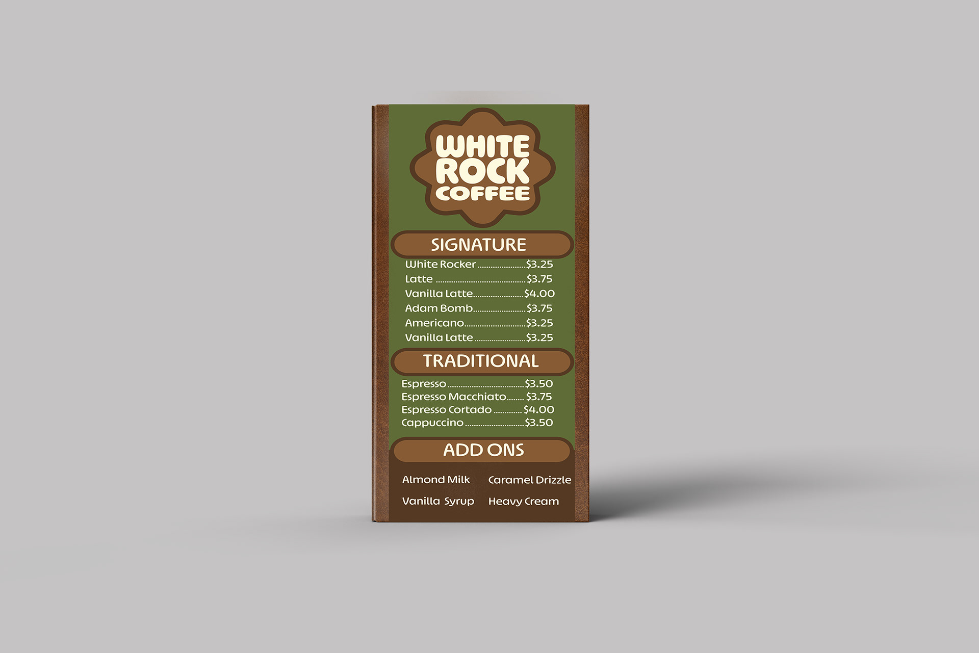
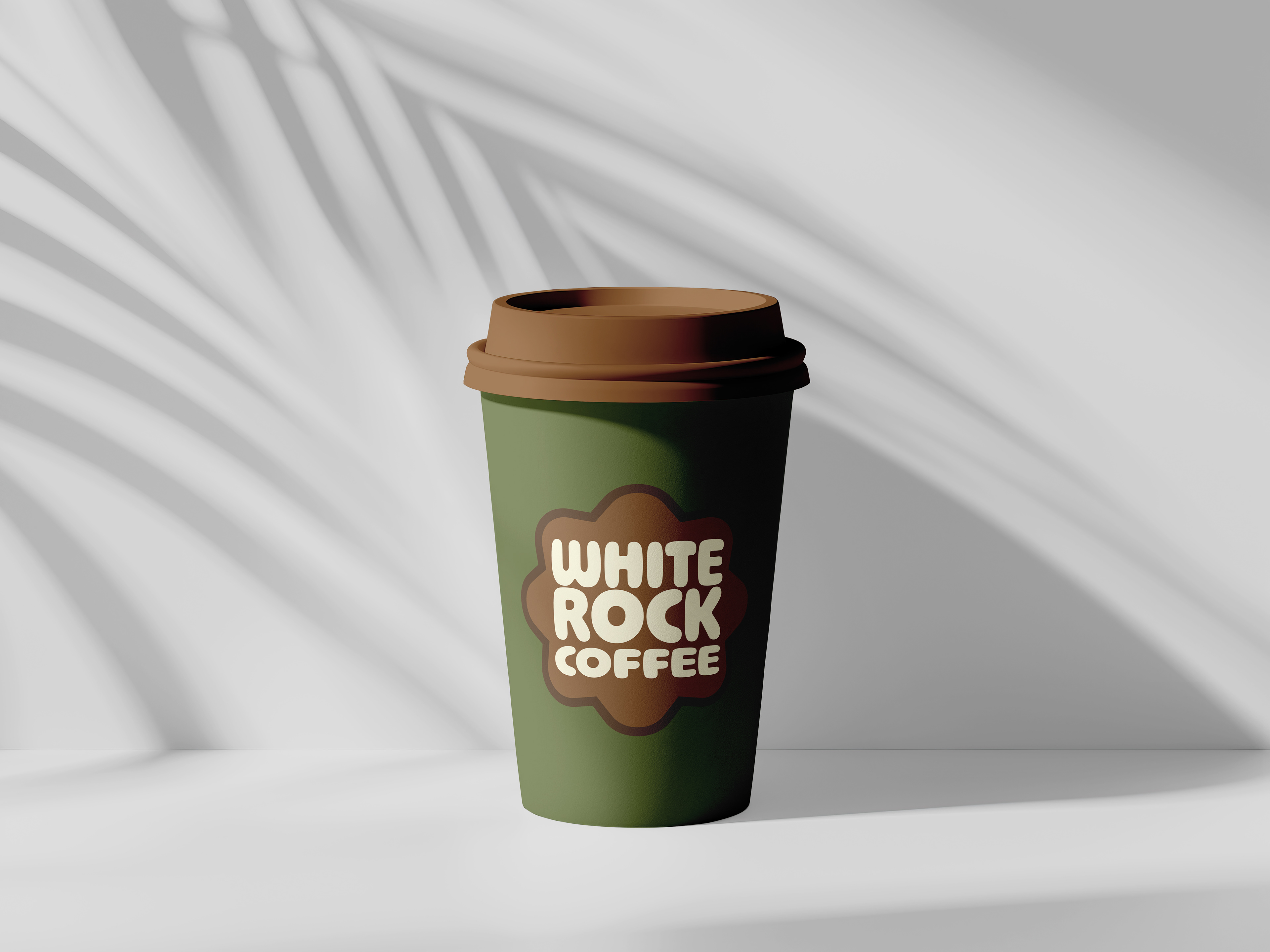
White Rock Coffee
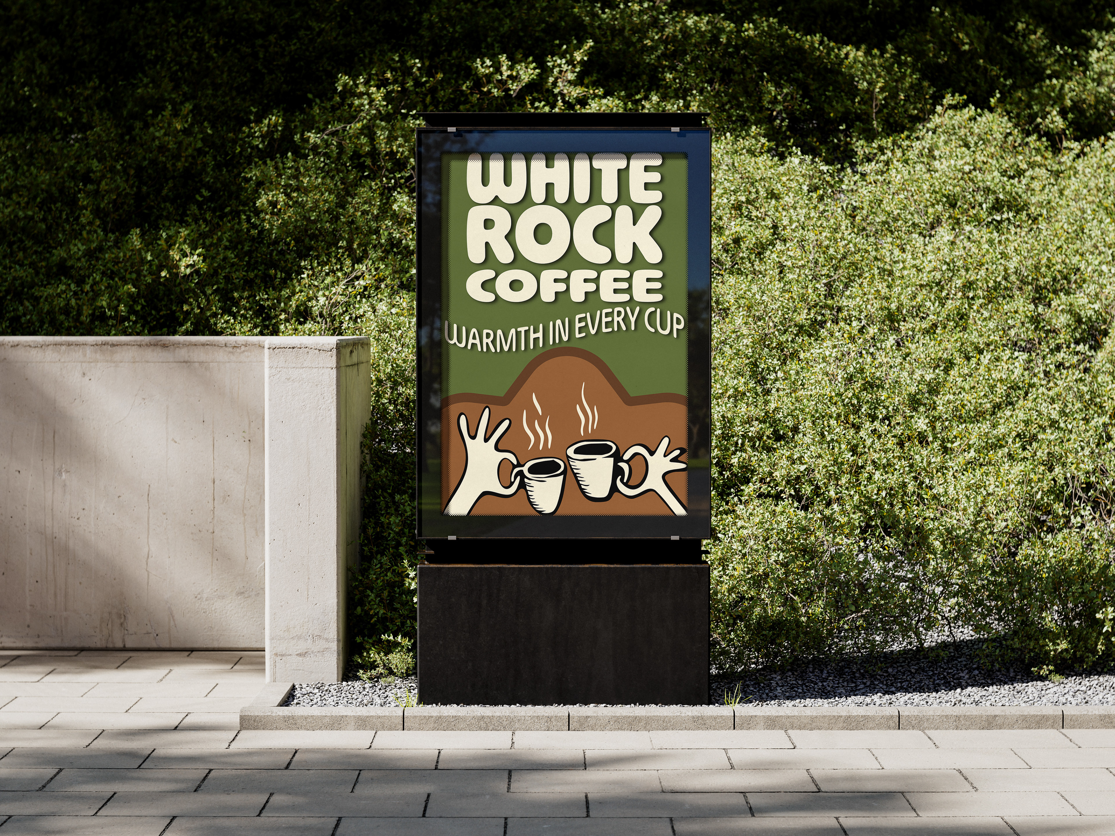
An organic, community focused rebranding and packaging system inspired by late 70s aesthetics. The goal was to pivot away from cold, clinical modern cafe environments by creating an identity rooted in warmth, organic geometry, and nostalgic charm.
The Execution
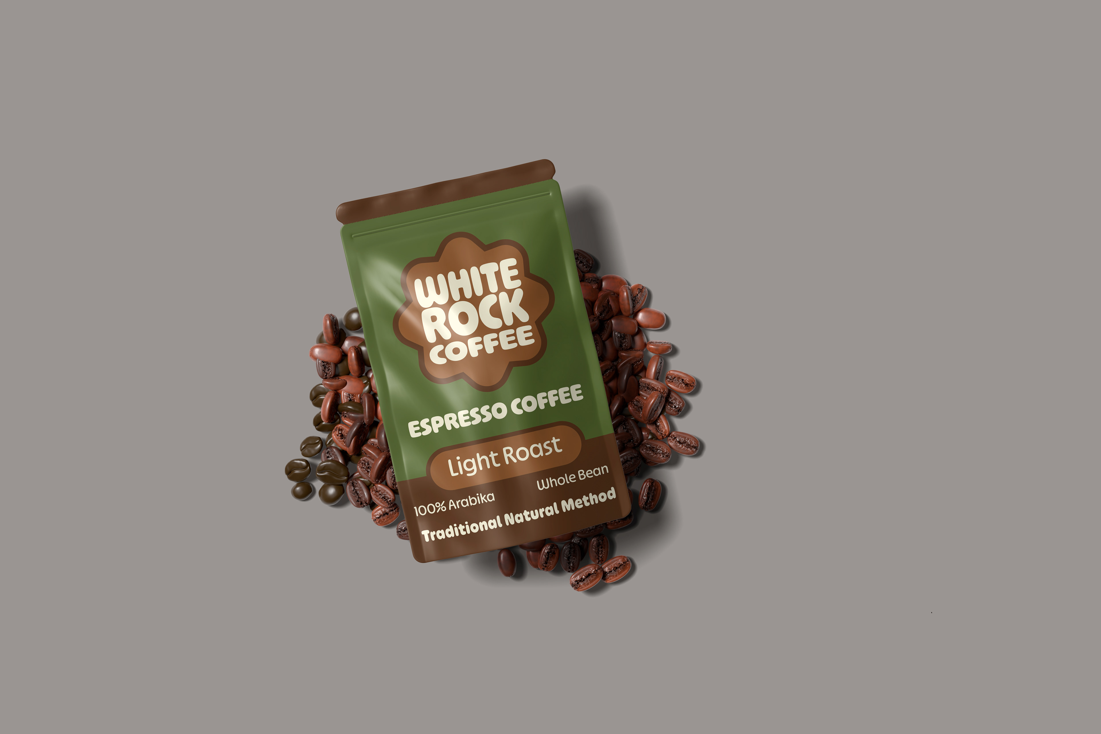
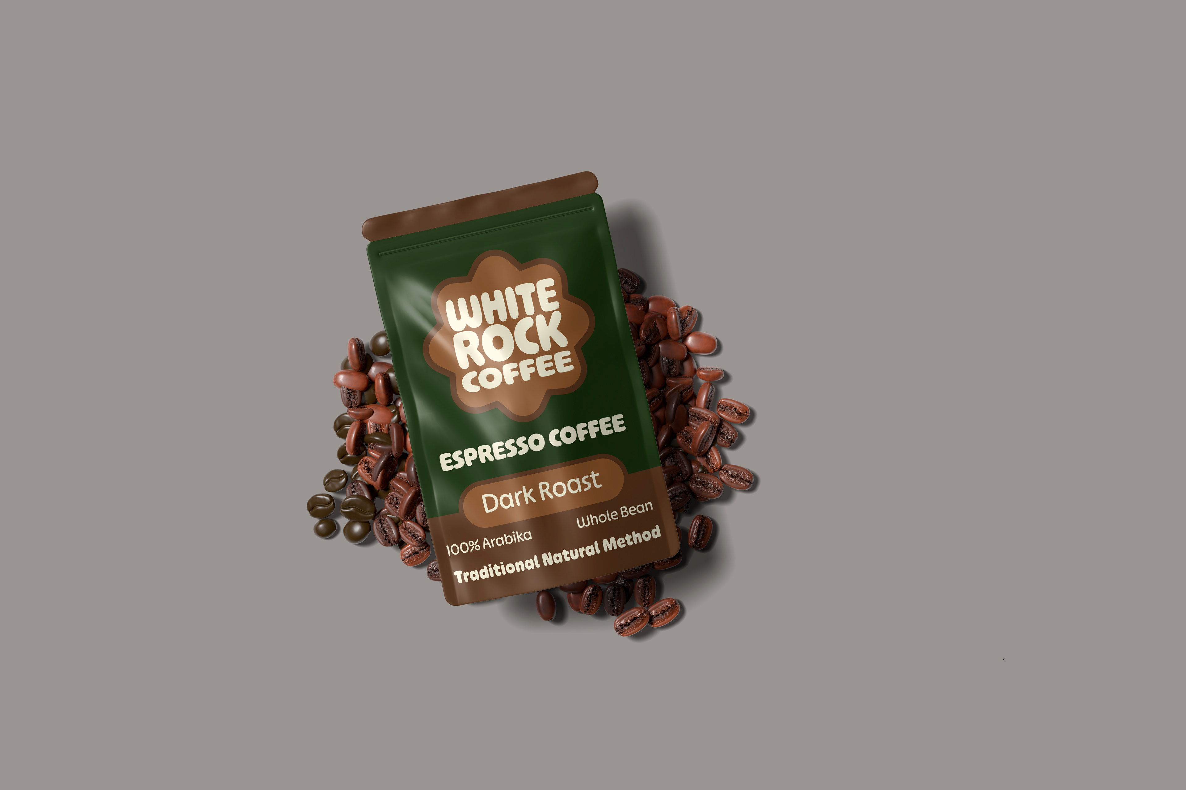
Typography: A heavy, interlocking display typeface anchors the main brand identity, balanced by a clean, highly legible secondary sans serif for menu pricing and product details.
Color Strategy: A palette of deep forest greens, rich espresso browns, and warm cream tones visually communicates the grounded nature of the brand while establishing a strong retail presence.
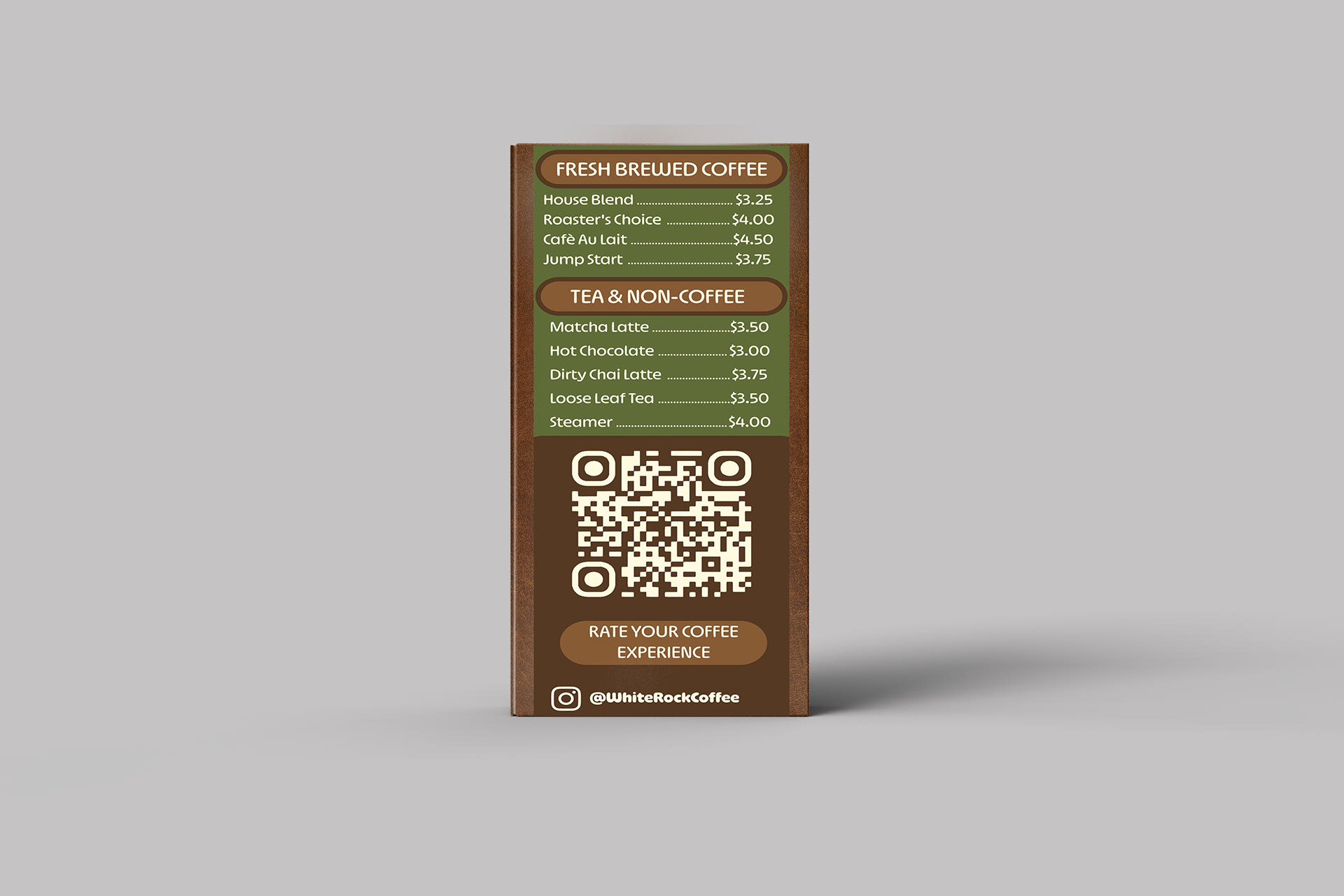
Deliverables: Custom roast packaging labels, a double-sided standing table tent menu, and retail beverage packaging.
Role & Tools
Concept development, visual identity, and product mockups using Photoshop and Illustrator.
Reflection
This project allowed me to explore the balance between playful, retro inspired geometry and clean architectural design. Working on a comprehensive rebrand meant ensuring the visual identity scaled smoothly across different surfaces, translating cleanly from the text-heavy constraints of a two-sided menu to the curved 3D surfaces of physical merchandise.