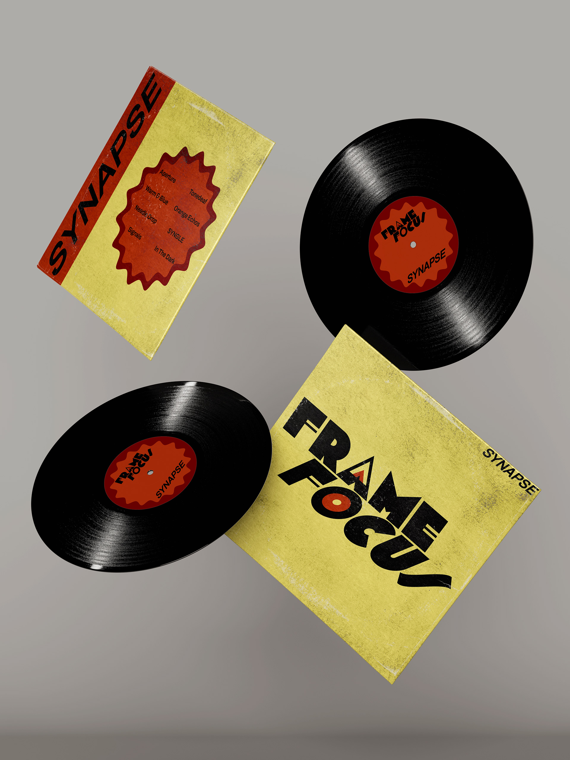
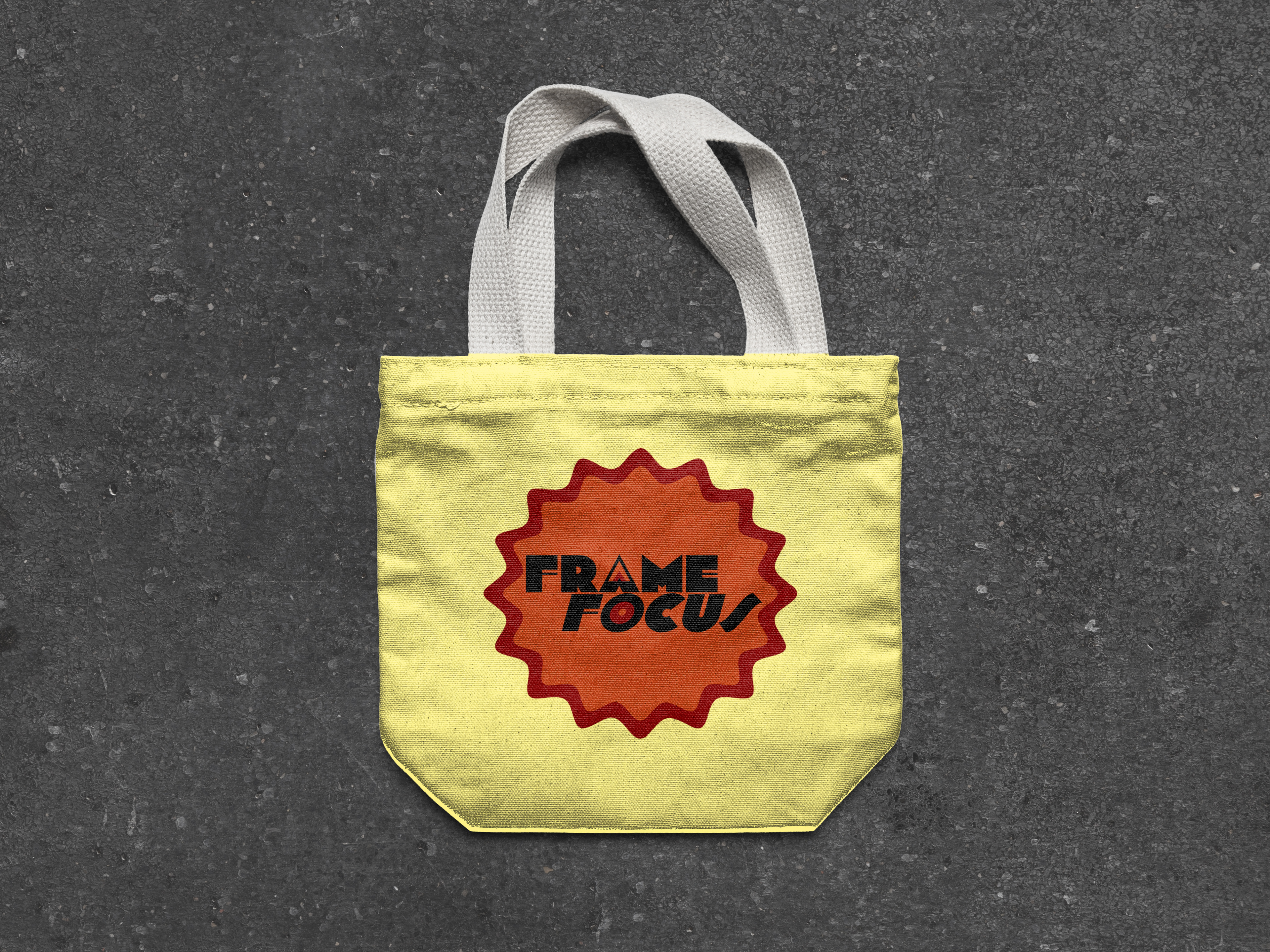
Frame & Focus
A conceptual branding and packaging system for a mid-century, analog-inspired record shop. The goal was to capture the warmth, Usage of heavy geometry, and the nostalgia of late 70s and 80s vinyl culture, bringing together both music and visual design.
The Execution
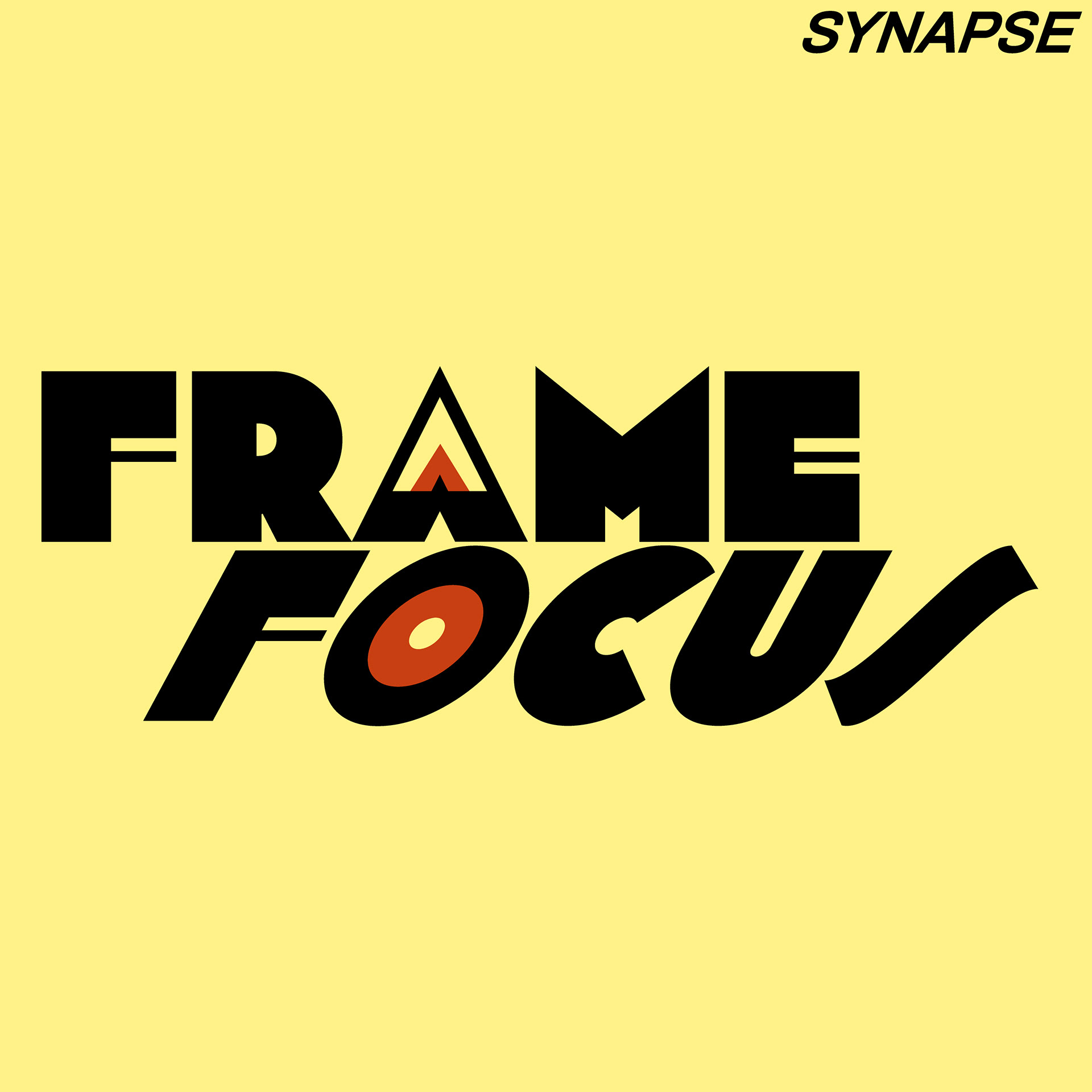
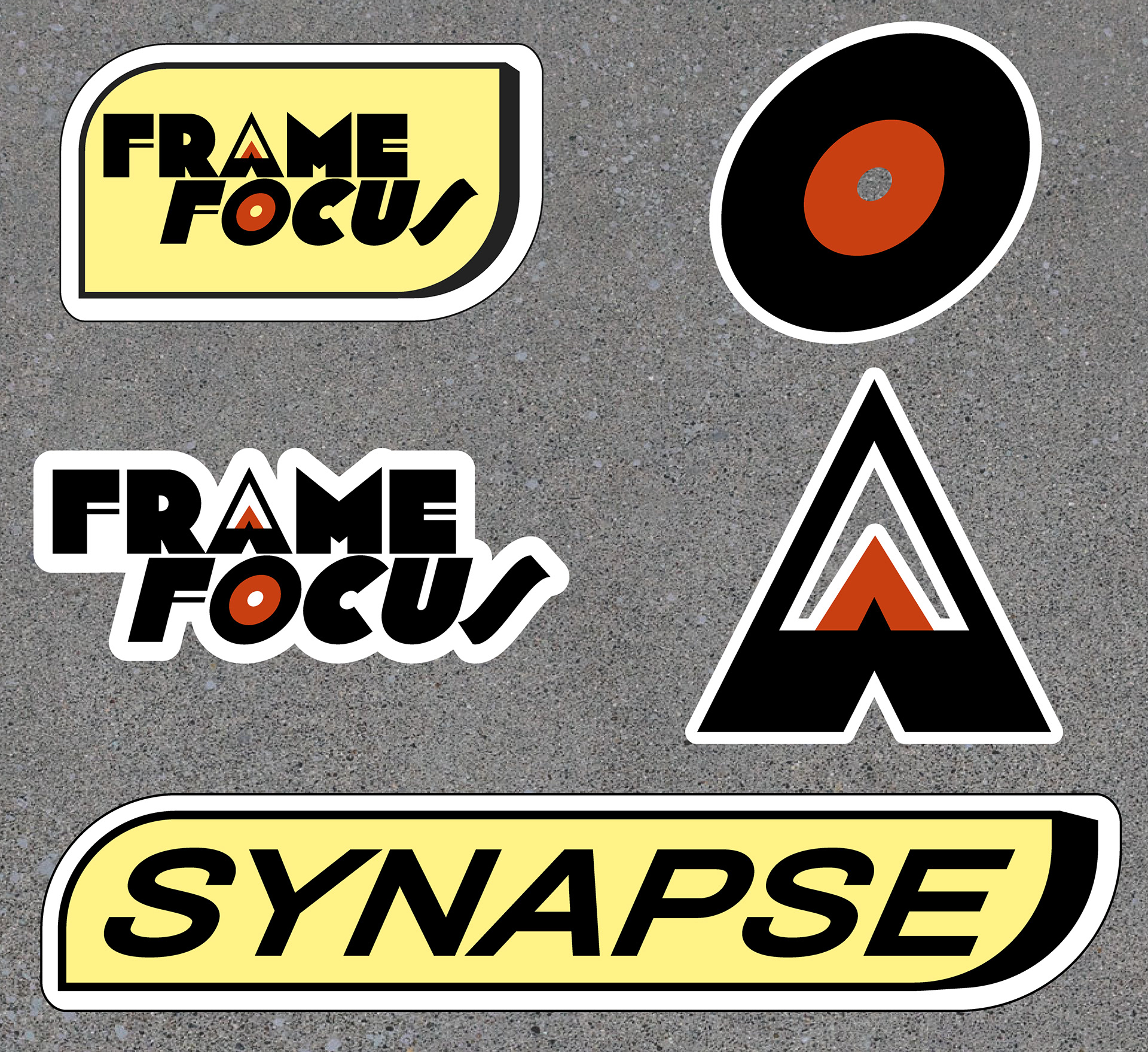
Typography: Bold, interlocking letterforms built on a strict geometric grid to give the logo a heavy, structural presence.
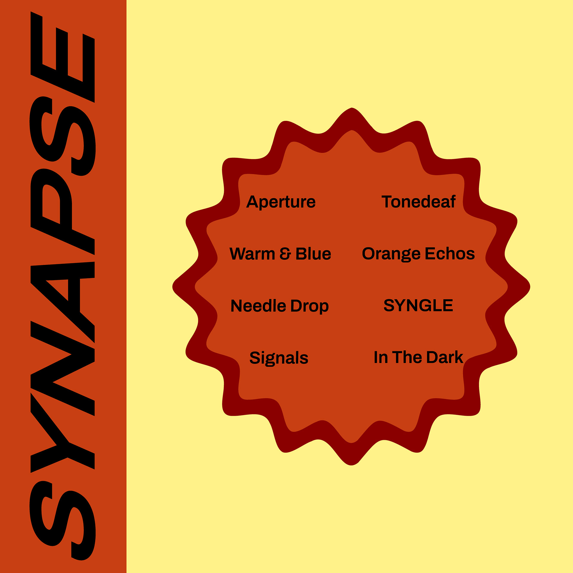
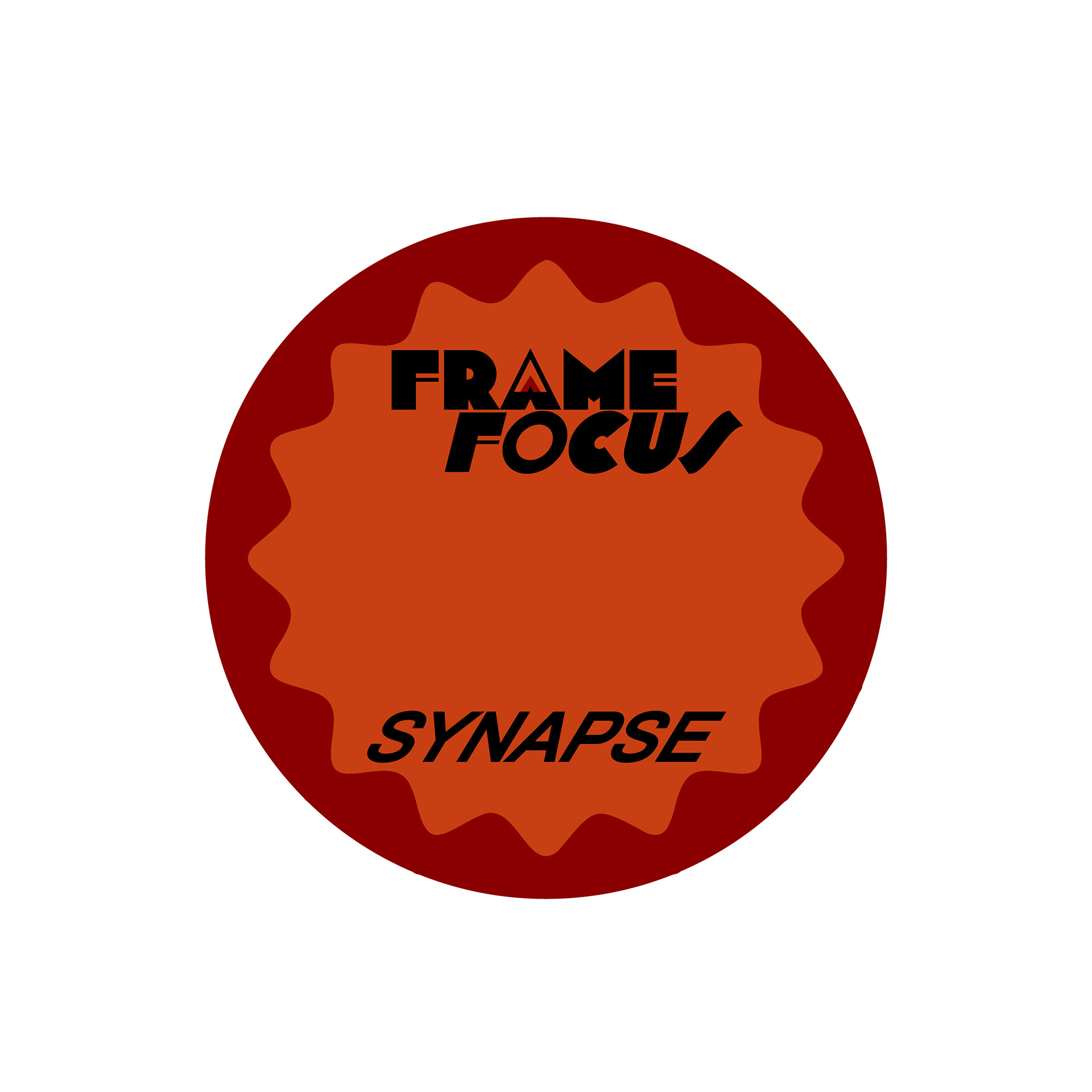
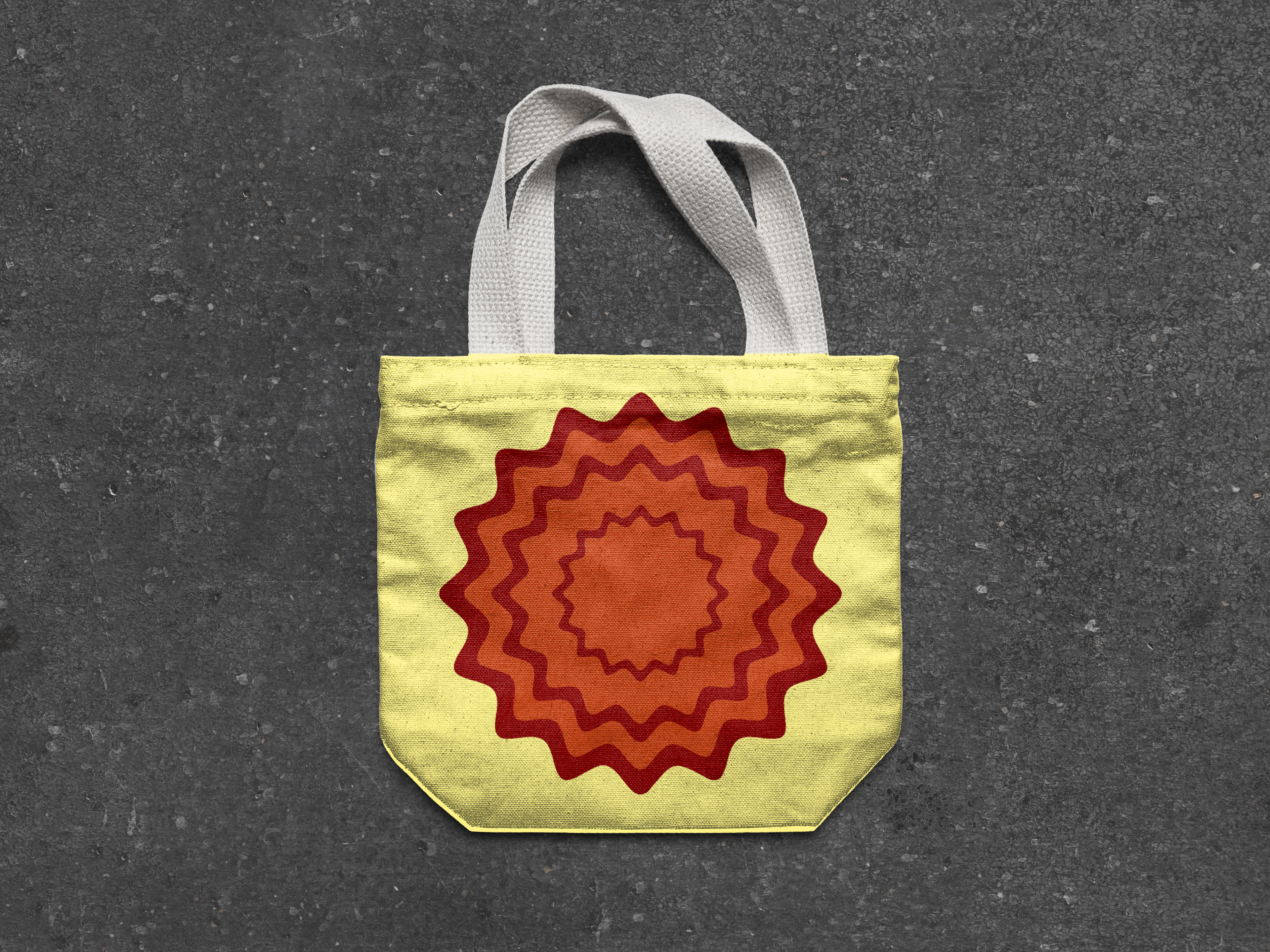
Graphic Elements: The red sticker graphic is inspired by retro price tags and collectible sale stickers found at old school record shops.
Deliverables: High fidelity vinyl gatefold packaging, double sided screen printed tote bags, and custom die cut stickers.
Role & Tools
Concept development, visual identity, and product mockups using Photoshop and Illustrator.
Reflection
This project pushed me to step outside my usual style and work within a highly disciplined geometric framework. Unlike my more texture heavy, streetwear focused designs, Frame & Focus was all about balancing clean negative space with bold layout structures. It taught me how to create clean, scalable assets that translate perfectly from a digital screen to physical merchandise.