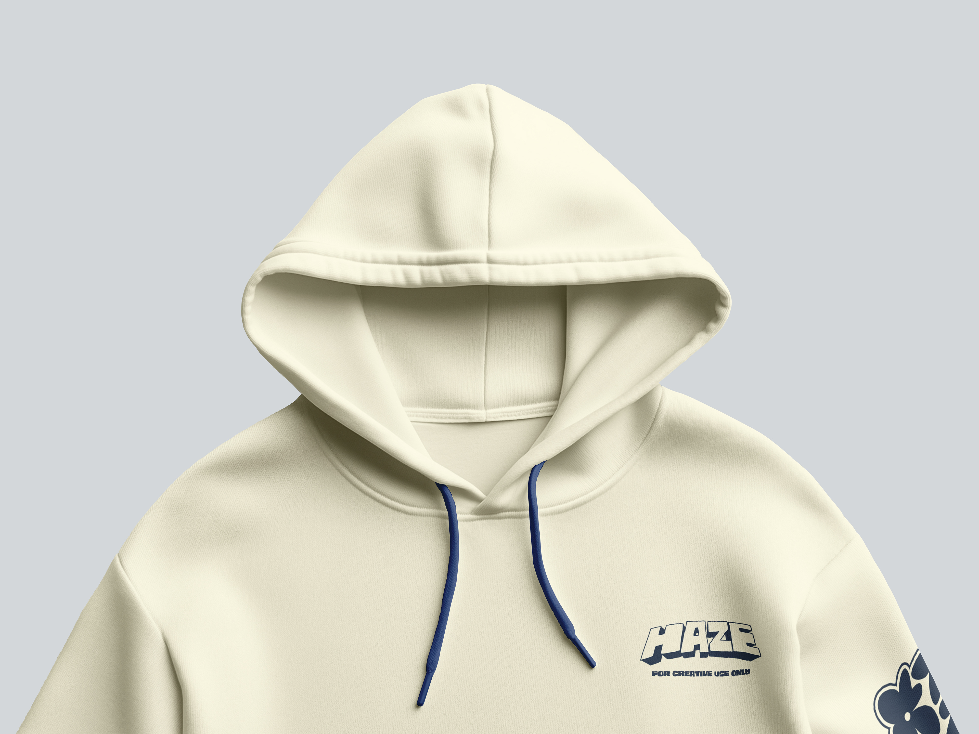
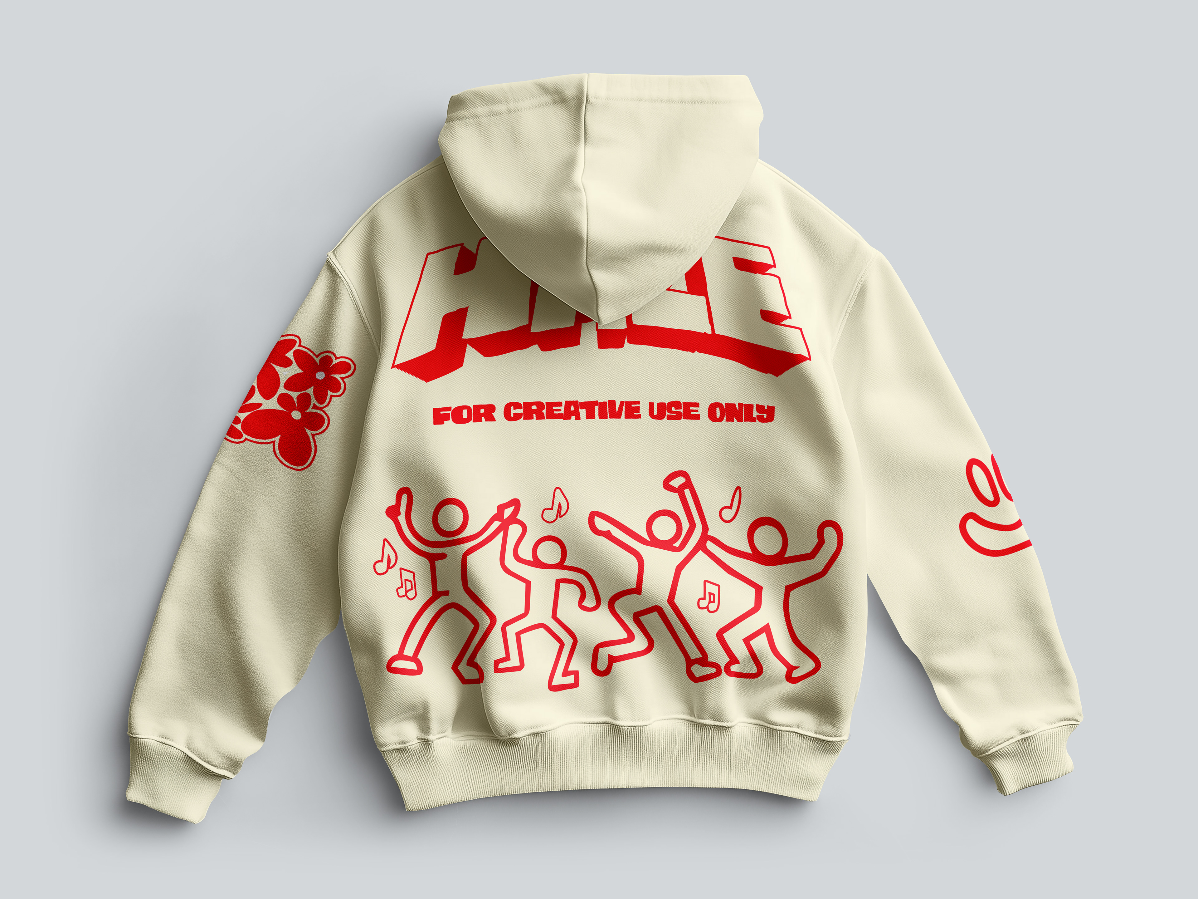
HAZE is an independent streetwear concept built around a simple tension: the tactile, worn-in feel of analog music culture against loose, hand-drawn illustration. The identity had to hold up across two very different physical scales, a heavyweight hoodie and a rigid skateboard deck, without losing its voice on either.
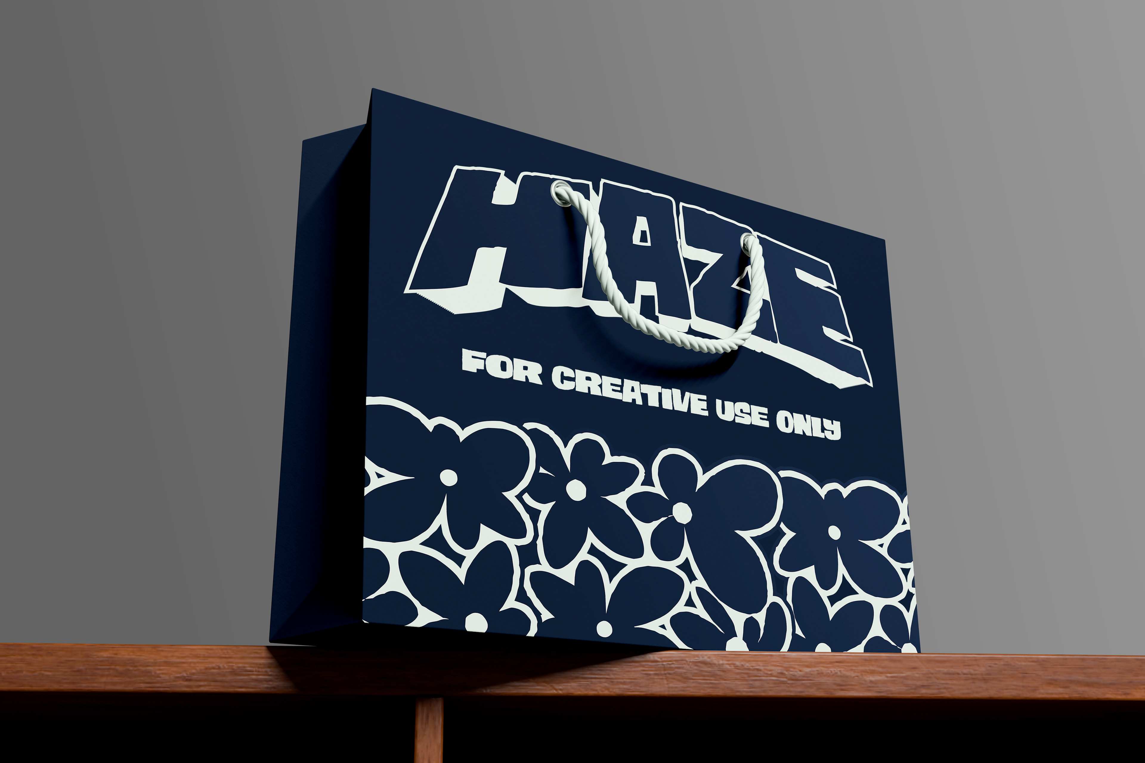
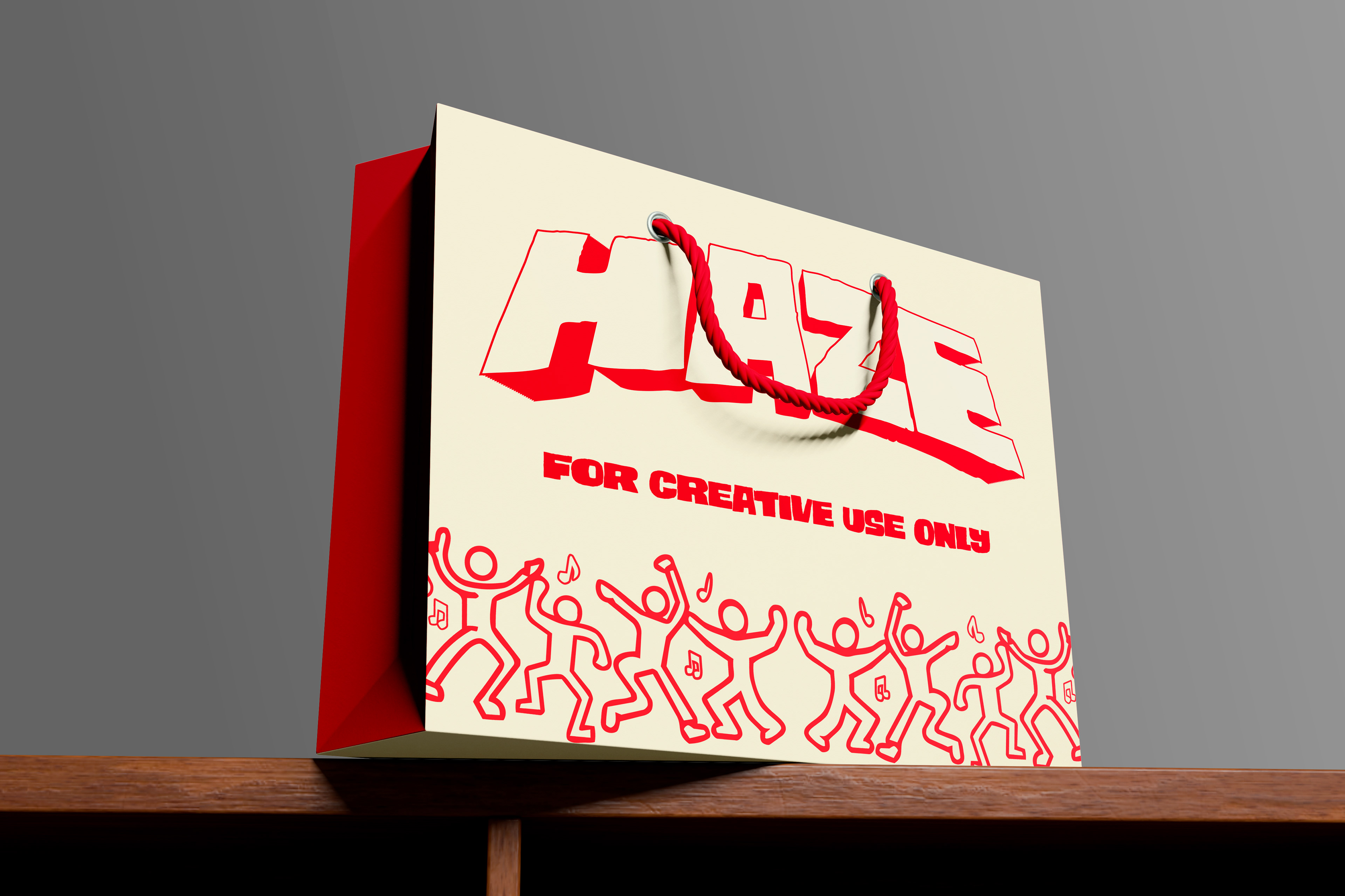
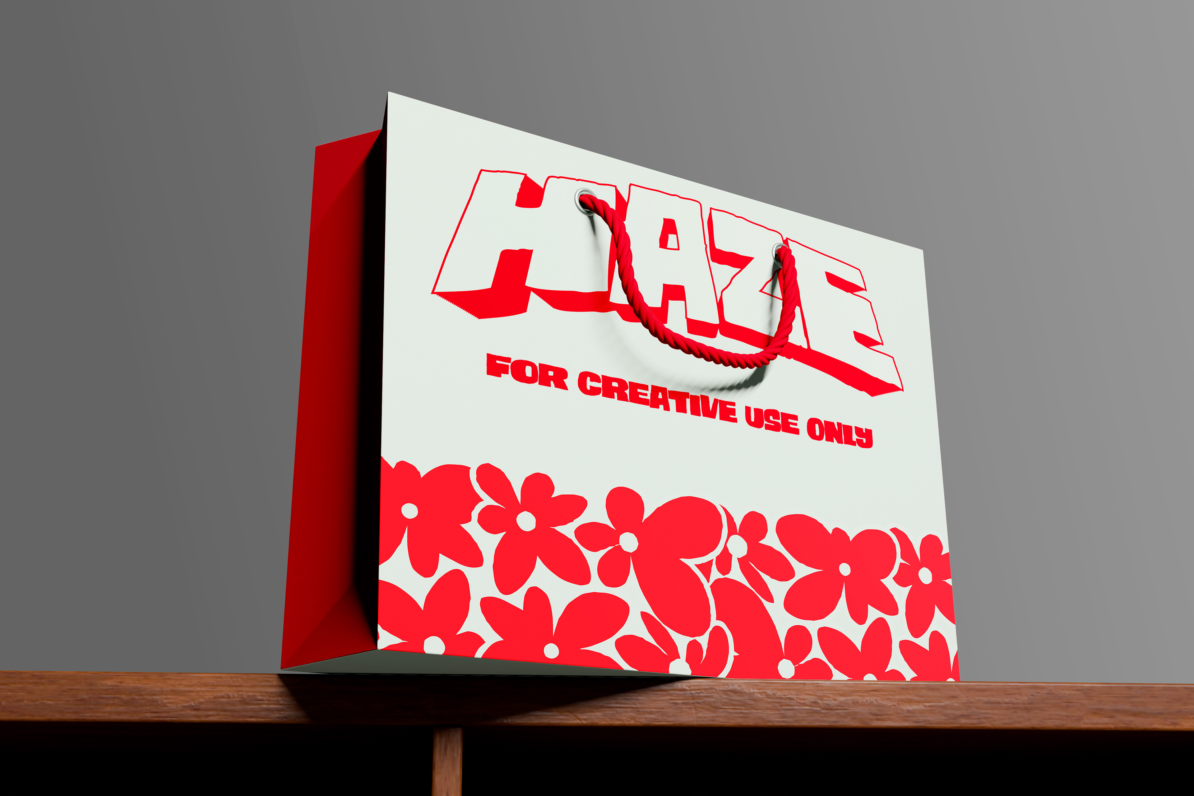
The Execution
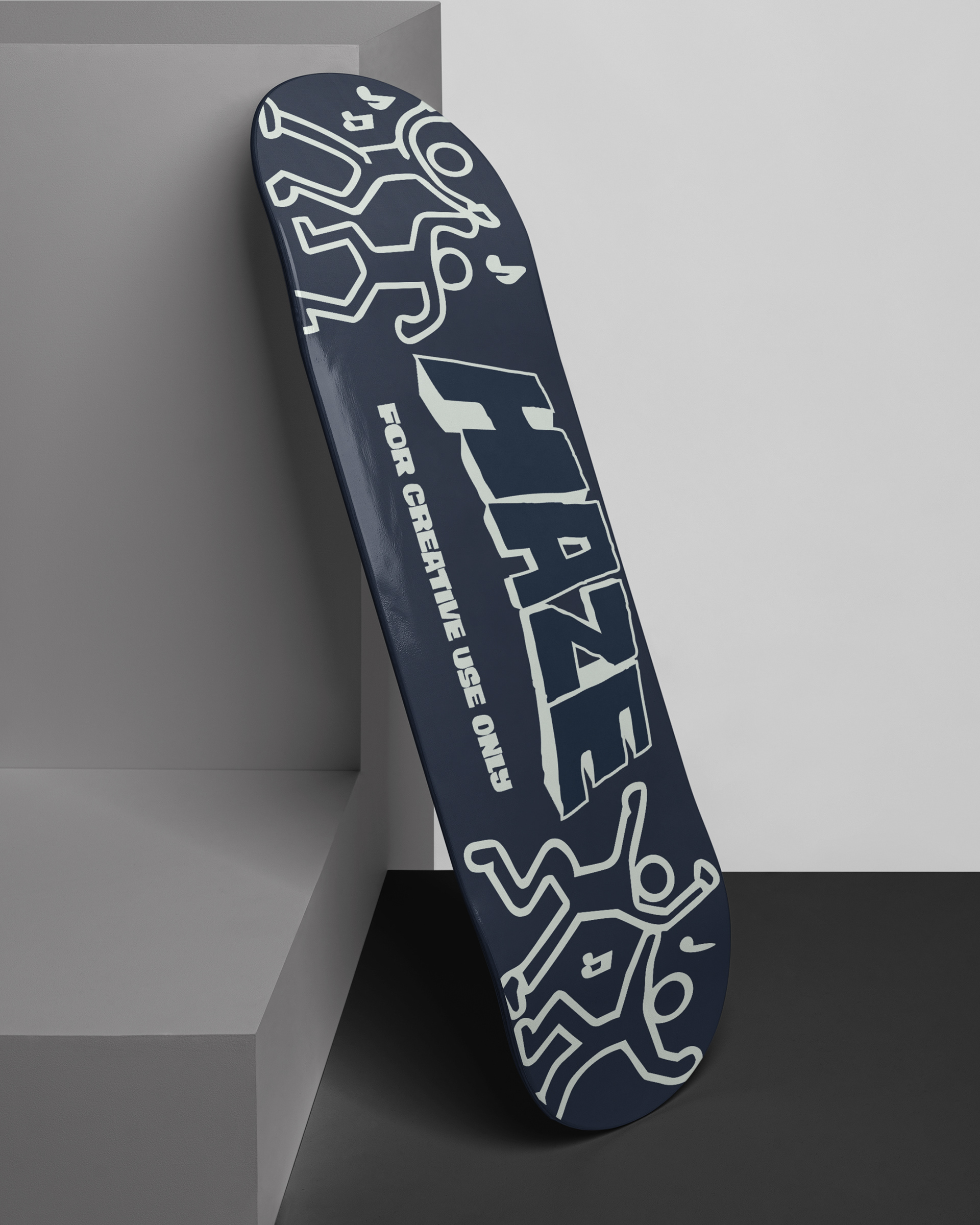
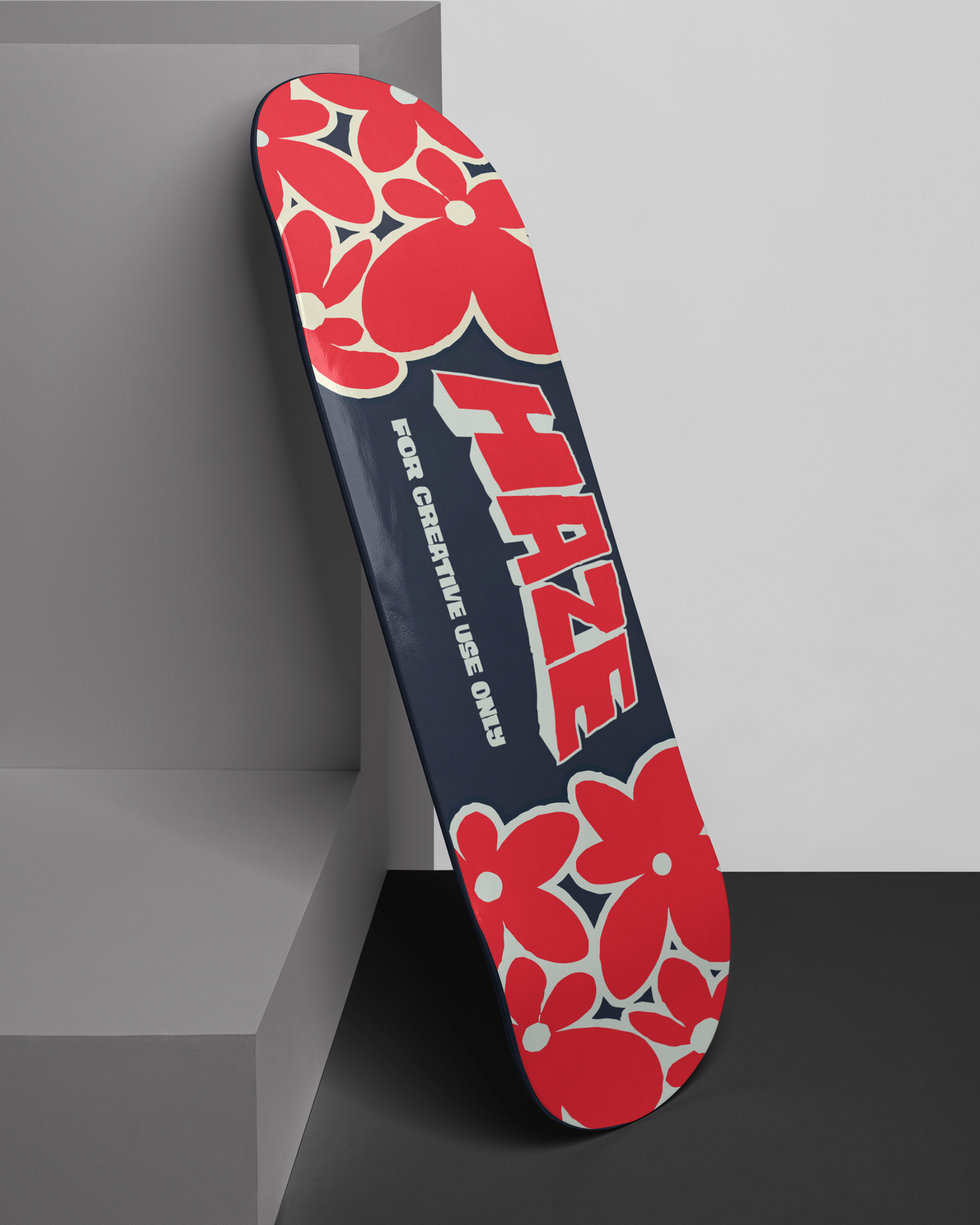
Typography: A heavy, arched block logotype with a deep drop shadow anchors the brand. It feels hand assembled rather than corporate, and it's balanced against fluid, hand-drawn figures that keep the system from feeling too rigid.
Color: Six core colors. Muted slate, navy, and cream form a grounded, retail-ready base, with sharp flashes of red for contrast and energy.
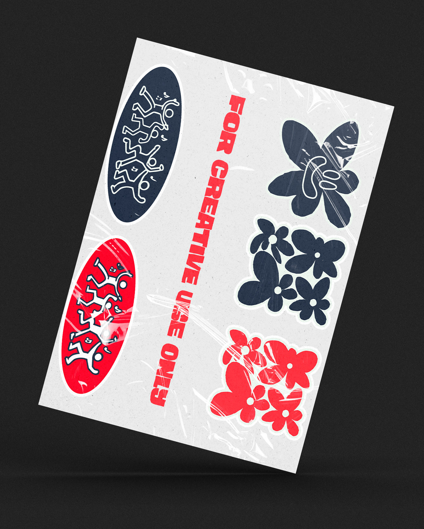
Deliverables: Heavyweight hoodies (front and back), a limited skateboard deck series, boutique packaging bags, and a custom sticker sheet.
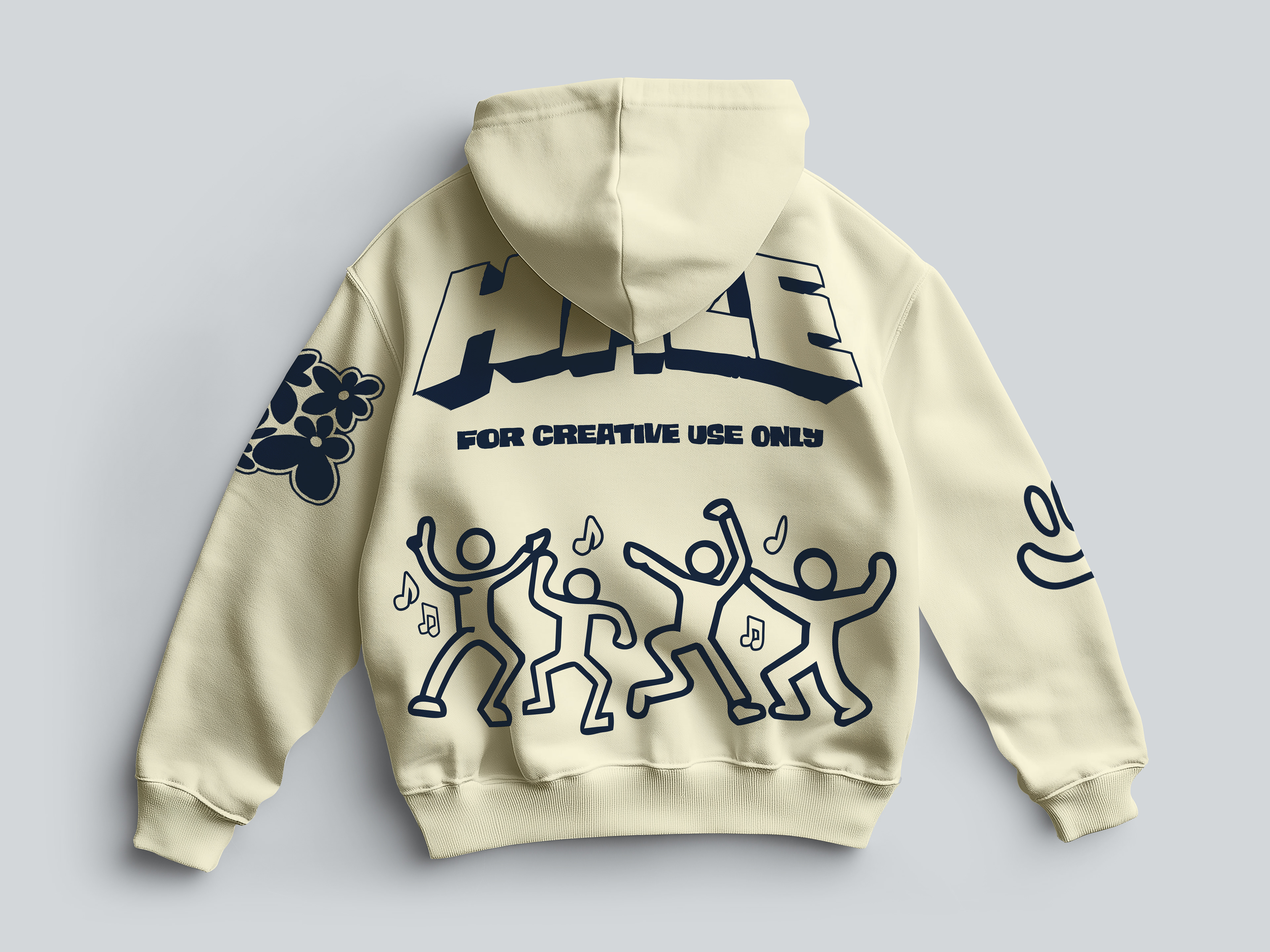
Role & Tools
I led concept development, the visual identity, and the illustration assets, then built out physical product mockups in Illustrator and Photoshop.
The Design Structure
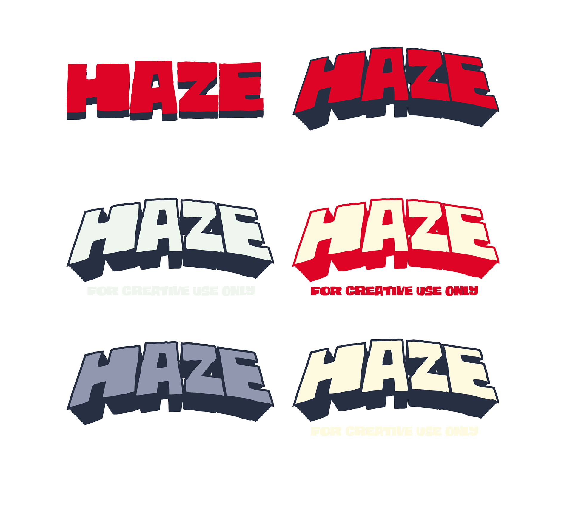
The logo was built in six color variants so it swaps cleanly between light and dark surfaces without losing readability, from a cream hoodie to a navy skate deck.

Reflection
The real test of this project wasn't the logo. It was whether the same visual language could survive completely different materials. A hoodie print and a skateboard graphic behave nothing alike: one drapes and folds, the other is flat and rigid with almost no margin for error at the edges. Getting the illustration assets to read consistently across both, without redrawing the brand each time, was the part I'm most proud of.